Modules Types and Their Settings
There’re 4 different modules types Modificator:
Sliders (for numeric values: Opacity, Diameter, etc)
Checkboxes (on and off switches)
Radio Buttons (one of mutually exclusive options: Blending Mode, Opacity Controller, etc)
Angular (used for brush rotation only)
Modules that are shared between different tools (like a tool Diameter for instance) also share settings but can be positiones and sized separately.
Common Module Settings
Modules Settings window allows to change settings of a modules. To open this window use a Flyout or RMB menu.
Some of settings are the same for all the modules types:
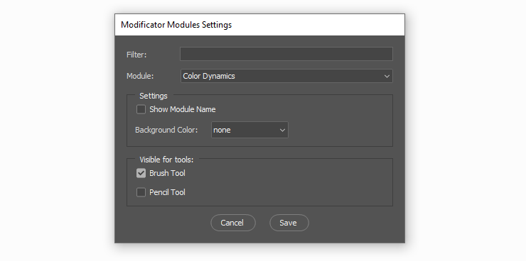
Show Module Name: toggle this off to hide a module name from the module. This works best for checkboxes or other modules in specific places to have a more compact layout. Here’s an example of a checkbox that turns Color Dynamics and 3 sliders for Dynamic Hue/Sat/Brightness as a very compact group. Since I know exactly what this checkbox and sliders are I din’t really need any name labels for them:

Visible for tools:: toggle this on/off to display/hide this model for a specific tool on a panel. These settings are also toggled fromSelect Modules to Show...window of a Flyout.Background Color: set a background color for a module. Background color can be used to group specific settings: here I have a violetDiametercontroller and a slider, an orangeOpacitycontroller and a slider and someColor Dynamicsmodules: a checkbox and sliders. Without the names for the Controllers I still understand where they belong from the assigned color:

Sliders
ClickorDragon sliders to change a value;Shift+ClickorShift+Dragto snap to Snap Values;Alt+Dragto nudge values — the value changes relatively to the marker position;
There are three sliders that are a little particular: three color sliders: Hue, Saturation and Lightness. Both Hue and Saturation keep the lightness of the color locked so that relative lightness of the color stays the same.
Slider specific settings:
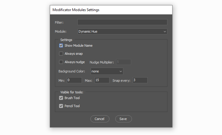
0% disabled the entire category: this setting is available only for Texture and Scatter sliders. When the setting is on, using the lowest value of the slider disables the catory;Always Snap: with this option turned on the slider will always snap to every Snap Value. This can be useful when only particular slider values are used, say 0% and 100% ofWetnessfor aMixer Brush;Always Nudge: makes the slider always behave as if theAltkey was used to change the value: the value will change relatively to the marker position. it’s also possible to set custom Nudge Multiplier:5is the default number, the value will move slower than the cursor;1will move slider with the speed of the cursor; less than1— faster than cursor;MinandMax: minimum and maximum values for a slider: sometimes it makes sense to limit a slider: for example to set a maximum Diameter or minimum Opacity;Snap every: this value is used for snapping withShift+Click;Show Colors on Background(color sliders only): when this option is turned on color sliders will show active color on their background;
Checkboxes
Checkboxes don’t have any particular settings. Oh man thanks for that.
Radio Buttons
There are several particular Radio Button modules
Eye Dropper module. It allows to change Eyedropper tool sample mode directly from the active tool. Here I’m changing sampling to Current Layer to paint with a color from a layer with Multiply blending mode and then quickly change sampling to All Layers:
Lasso module. Allows to quickly switch between lasso and polygonal lasso
Shape tool mode module. Allows to switch between Shape/Path/Pixels tool mode of vector tools (Rectangle, Ellipse, Line, etc)
Radio Buttons Settings:
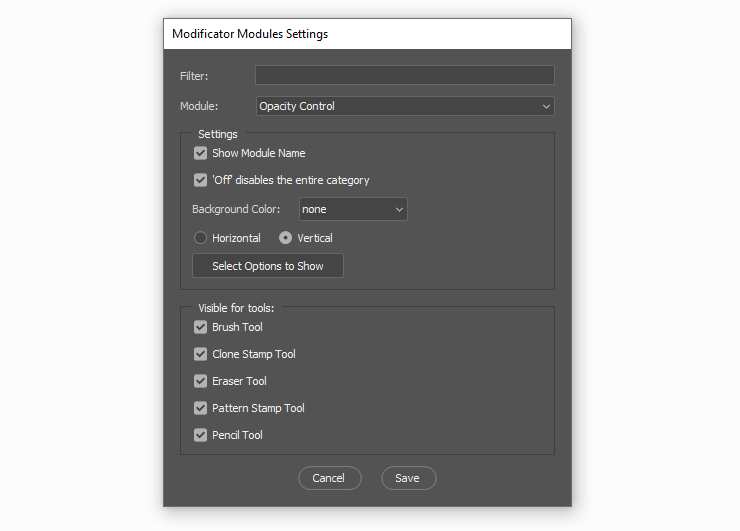
Off disabled the entire category: when the setting is on, using theOffoption of the radio module disables the catory: for example settingOpacityoff disables the wholeTransfercategory;HorizontalorVertical: the way radio buttons are oriented;Select Options to Show: it’s possible to limit the amount of options to only the ones that are needed: for example rarely you’ll want to show all 29 brush blending modes;
Angular
Angular module has almost the same settings as a Slider module with the exception of an absence of the minimum and maximum setting.